# Style Manager
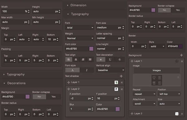
The Style Manager module is responsible to show and update style properties relative to your Components. In this guide, you will see how to setup and take full advantage of the built-in Style Manager UI in GrapesJS. The default UI is a lightweight component with built-in properties, but as you'll see next in this guide, it's easy to extend with your own elements or even create the Style Manager UI from scratch by using the Style Manager API.
WARNING
To get a better understanding of the content in this guide, we recommend reading Components first
WARNING
This guide is referring to GrapesJS v0.18.1 or higher
TIP
Looking for a UI that is easy and ready to customize? Checkout the Grapes Studio SDK! (opens new window)
# Configuration
To change the default configurations you have to pass the styleManager property with the main configuration object.
const editor = grapesjs.init({
  ...
  styleManager: {
    sectors: [...],
    ...
  }
});
Check the full list of available options here: Style Manager Config (opens new window)
# Initialization
The Style Manager module is organized in sectors where each sector contains a list of properties to display. The default Style Manager configuration contains already a list of default common property styles and you can use them by simply skipping the styleManagerConfig.sectors option.
grapesjs.init({
  ...
  styleManager: {
    // With no defined sectors, the default list will be loaded
    // sectors: [...],
    ...
  },
});
DANGER
It makes sense to show the Style Manager UI only when you have at least one component selected, so by default the Style Manager is hidden if there are no selected components.
# Sector definitions
Each sector is identified by its name and a list of properties to display. You can also specify the id in order to access the sector via API (if not indicated it will be generated from the name) and the default open state.
grapesjs.init({
  // ...
  styleManager: {
    sectors: [
      {
        name: 'First sector',
        properties: [],
        // id: 'first-sector', // Id generated from the name
        // open: true, // The sector is open by default
      },
      {
        open: false, // render it closed by default
        name: 'Second sector',
        properties: [],
      },
    ],
  },
});
# Property definitions
Once you have defined your sector you can start adding property definitions inside properties. Each property has a common set of options (label, default, etc.) and others specific by their type.
Let's see below a simple definition for controlling the padding style.
sectors: [
  {
    name: 'First sector',
    properties: [
      {
        // Default options
        // id: 'padding', // The id of the property, if missing, will be the same as `property` value
        type: 'number',
        label: 'Padding', // Label for the property
        property: 'padding', // CSS property to change
        default: '0', // Default value to display
        // Additonal `number` options
        units: ['px', '%'], // Units (available only for the 'number' type)
        min: 0, // Min value (available only for the 'number' type)
      },
    ],
  },
];
This will render the number input UI and will change the padding CSS property on the selected component.
The flexibility of the definition allows you to create easily different UI inputs for any possible CSS property. You're free to decide what will be the best UI for your users. If you take for example a numeric property like font-size, you can follow its CSS specification and define it as a number
{
  type: 'number',
  label: 'Font size',
  property: 'font-size',
  units: ['px', '%', 'em', 'rem', 'vh', 'vw'],
  min: 0,
}
or you can decide to show it as a select and make available only a defined set of values (eg. based on your Design System tokens).
{
  type: 'select',
  label: 'Font size',
  property: 'font-size',
  default: '1rem',
  options: [
    { id: '0.7rem', label: 'small' },
    { id: '1rem', label: 'medium' },
    { id: '1.2rem', label: 'large' },
  ]
}
Each type defines the specific UI view and a model on how to handle inputs and updates. Let's see below the list of all available default types with their relative UI and models.
# Default types
TIP
Each Model describes more in detail available props and their usage.
base- The base type, renders as a simple text input field. Model: Property
// Example { // type: 'base', // Omitting the type in definition will fallback to the 'base' property: 'some-css-property', label: 'Base type', default: 'Default value', },color- Same props asbasebut the UI is a color picker. Model: Property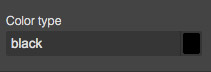
number- Number input field for numeric values. Model: PropertyNumber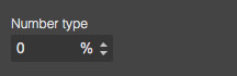
// Example { type: 'number', property: 'width', label: 'Number type', default: '0%', // Additional props units: ['px', '%'], min: 0, max: 100, },slider- Same props asnumberbut the UI is a slider. Model: PropertyNumber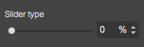
select- Select input with options. Model: PropertySelect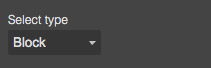
// Example { type: 'select', property: 'display', label: 'Select type', default: 'block', // Additional props options: [ {id: 'block', label: 'Block'}, {id: 'inline', label: 'Inline'}, {id: 'none', label: 'None'}, ] },radio- Same props asselectbut the UI is a radio button. Model: PropertySelect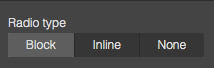
composite- This type is great for CSS shorthand properties, where the final value is a composition of multiple sub properties. Model: PropertyComposite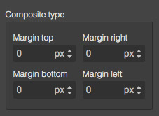
// Example { type: 'composite', property: 'margin', label: 'Composite type', // Additional props properties: [ { type: 'number', units: ['px'], default: '0', property: 'margin-top' }, { type: 'number', units: ['px'], default: '0', property: 'margin-right' }, { type: 'number', units: ['px'], default: '0', property: 'margin-bottom' }, { type: 'number', units: ['px'], default: '0', property: 'margin-left' }, ] },stack- This type is great for CSS multiple properties liketext-shadow,box-shadow,transform, etc. Model: PropertyStack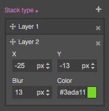
// Example
{
  type: 'stack',
  property: 'text-shadow',
  label: 'Stack type',
  // Additional props
  properties: [
    { type: 'number', units: ['px'], default: '0', property: 'x' },
    { type: 'number', units: ['px'], default: '0', property: 'y' },
    { type: 'number', units: ['px'], default: '0', property: 'blur' },
    { type: 'color', default: 'black', property: 'color' },
  ]
},
# Built-in properties
In order to speed up the Style Manager configuration, GrapesJS is shipped with a set of already defined common CSS properties which you can reuse and extend.
sectors: [
  {
    name: 'First sector',
    properties: [
      // Pass the built-in CSS property as a string
      'width',
      'min-width',
      // Extend the built-in property with your props
      {
        extend: 'max-width',
        units: ['px', '%'],
      },
      // If the property doesn't exist it will be converted to a base type
      'unknown-property', // -> { type: 'base', property: 'unknown-property' }
    ],
  },
];
TIP
You can check if the property is available by running
editor.StyleManager.getBuiltIn('property-name');
or get the list of all available properties with
editor.StyleManager.getBuiltInAll();
# I18n
If you're planning to have a multi-language editor you can easily connect sector and property labels to the I18n module via their IDs.
grapesjs.init({
  styleManager: {
    sectors: [
      {
        id: 'first-sector-id',
        // You can leave the name as a fallback in case the i18n definition is missing
        name: 'First sector',
        properties: [
          'width',
          {
            id: 'display-prop-id', // By default the id is the same as its property name
            label: 'Display',
            type: 'select',
            property: 'display',
            default: 'block',
            options: [
              { id: 'block', label: 'Block' },
              { id: 'inline', label: 'Inline' },
              { id: 'none', label: 'None' },
            ],
          },
        ],
      },
      // ...
    ],
  },
  i18n: {
    // Use `messagesAdd` in order to extend the default set
    messagesAdd: {
      en: {
        styleManager: {
          sectors: {
            'first-sector-id': 'First sector EN',
          },
          properties: {
            width: 'Width EN',
            'display-prop-id': 'Display EN',
          },
          options: {
            'display-prop-id': {
              block: 'Block EN',
              inline: 'Inline EN',
              none: 'None EN',
            },
          },
        },
      },
    },
  },
});
# Component constraints
When you define custom components you can also indicate, via stylable and unstylable props, which CSS properties should be available for styling. In that case, the Style Manager will only show the available properties. If the sector doesn't contain any available property, it won't be shown.
const customComponents = (editor) => {
  // Component A
  editor.Components.addType('cmp-a', {
    model: {
      defaults: {
        // When this component is selected, the Style Manager will show only the following properties
        stylable: ['width', 'height'],
      },
    },
  });
  // Component B
  editor.Components.addType('cmp-b', {
    model: {
      defaults: {
        // When this component is selected, the Style Manager will hide the following properties
        unstylable: ['color'],
      },
    },
  });
};

grapesjs.init({
  // ...
  plugins: [customComponents],
  components: [
    { type: 'cmp-a', components: 'Component A' },
    { type: 'cmp-b', components: 'Component B' },
  ],
  styleManager: {
    sectors: [
      {
        name: 'First sector',
        properties: ['width', 'min-width', 'height', 'min-height'],
      },
      {
        name: 'Second sector',
        properties: ['color', 'font-size'],
      },
    ],
  },
});
# Programmatic usage
For a more advanced usage you can rely on the Style Manager API to perform different kind of actions related to the module.
Managing sectors/properties post-initialization.
// Get the module from the editor instance
const sm = editor.StyleManager;

// Add new sector
const newSector = sm.addSector('sector-id', {
  name: 'New sector',
  open: true,
  properties: ['width'],
});

// Add new property to the sector
sm.addProperty('sector-id', {
  type: 'number',
  property: 'min-width',
});

// Remove sector
sm.removeSector('sector-id');
Managing selected targets.
// Select the first button in the current page
const wrapperCmp = editor.Pages.getSelected().getMainComponent();
const btnCmp = wrapperCmp.find('button')[0];
btnCmp && sm.select(btnCmp);

// Set as a target the CSS selector (the relative CSSRule will be created if doesn't exist yet)
sm.select('.btn > span');
// Get the last selected target
const lastTarget = sm.getLastSelected();
lastTarget?.toCSS && console.log(lastTarget.toCSS());

// Update selected targets with a custom style
sm.addStyleTargets({ color: 'red' });
Adding/extending built-in property definitions.
const myPlugin = (editor) => {
  editor.StyleManager.addBuiltIn('new-prop', {
    type: 'number',
    label: 'New prop',
  })
};

grapesjs.init({
  // ...
  plugins: [myPlugin],
  styleManager: {
    sectors: [
      {
        name: 'My sector',
        properties: [ 'new-prop', ... ],
      },
    ],
  },
})
# Customization
The default types should cover most of the common styling properties but in case you need a more advanced control over styling you can define your own types or even create a completely custom Style Manager UI from scratch.
# Adding new types
In order to add a new type you have to use the styleManager.addType API call and indicate all the necessary methods to make it work properly with the editor. Here an example of implementation by using the native range input.
# Custom Style Manager
In case you need a completely custom Style Manager UI (eg. you have to use your UI components), you can create it from scratch by relying on the same sector/propriety architecture or even interfacing directly with selected targets.
All you have to do is to indicate the editor your intent to use a custom UI and then subscribe to the style:custom event that will let you know when is the right moment to create/update your UI.
const editor = grapesjs.init({
  // ...
  styleManager: {
    custom: true,
    // ...
  },
});

editor.on('style:custom', (props) => {
  // props.container (HTMLElement)
  //    The default element where you can append your
  //    custom UI in order to render it in the default position.
  // Here you would put the logic to render/update your UI by relying on Style Manager API
});
Here an example below of a custom Style Manager UI rendered by using Vuetify (Vue Material components) and relying on the default sector/propriety state architecture via API.
From the example above you can notice how we subscribe to style:custom and update this.sectors = sm.getSectors({ visible: true }); on each trigger, and this is enough for the framework to update the rest of the template automatically.
In case you need to get/update the selected style targets directly, you can also rely on these APIs.
// Get the module from the editor instance
const sm = editor.StyleManager;

// Select the first button in the current page
const wrapperCmp = editor.Pages.getSelected().getMainComponent();
const btnCmp = wrapperCmp.find('button')[0];
btnCmp && sm.select(btnCmp);

// You can also select CSS query as a target
sm.select('.btn > span');

// Once the target is selected, you can check its current style object
console.log(sm.getSelected()?.getStyle());

// and update all selected target styles when necessary
sm.addStyleTargets({ color: 'red' });
# Events
For a complete list of available events, you can check it here.
← Pages Storage Manager →