# Selector Manager
The Selector allows the reuse of styles across all of your Components in the project (exactly what classes do in HTML) and the main goal of the Selector Manager is to collect them and indicate the current state of the selection.
WARNING
This guide is referring to GrapesJS v0.17.28 or higher
# Configuration
To change the default configurations you have to pass the selectorManager property with the main configuration object.
const editor = grapesjs.init({
  ...
  selectorManager: {
    ...
  }
});
Check the full list of available options here: Selector Manager Config (opens new window)
# Initialization
The Selector Manager starts to collect data once componenets and styles are loaded. The default UI is displayed along with the default panels provided by GrapesJS core, in case you need to setup the editor with your own panels we recommend following the Getting Started guide.
In the example below we init the editor with already provided components and styles.
const editor = grapesjs.init({
  container: '#gjs',
  height: '100%',
  storageManager: false,
  components: `
    <div class="class-a">Element A</div>
    <div class="class-a class-b">Element A-B</div>
    <div class="class-a class-b class-c">Element A-B-C</div>
  `,
  style: `
    .class-a { color: red }
    .class-b { color: green }
    .class-c { color: blue }
  `,
});
Internally, the example above will provide to Selector Manager 3 selectors: class-a, class-b and class-c.
Without any selected component, the Selector Manager UI is hidden by default (along with the Style Manager). By selecting the Element A-B-C you will see the current selection of what will be actually styled.
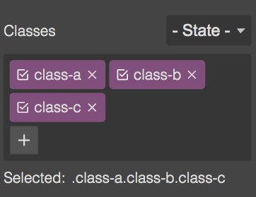
The label Selected indicates on which CSS query styles will be applied, so if you try to change the color of the current selection, this is what you'll get in the final code:
.class-a.class-b.class-c {
  color: #483acb;
}
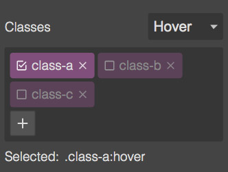
You can also disable specific selectors and change the state (eg. Hover) in order to switch the target of styling.
# Component-first selectors
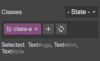
By default, selecting components with classes will indicate their selectors as target style. That means that any change in Style Manager will be applied to all components containing those Selected classes.
In case you need to select single components as style targets, you can enable componentFirst option.
const editor = grapesjs.init({
  // ...
  selectorManager: {
    componentFirst: true,
  },
});
This option enables also the possibility to style multiple components and the ability to sync common selectors with the current component styles (the refresh icon).
WARNING
With multiple selection, the Style Manager shows always styles of the last selected component.
# Programmatic usage
If you need to manage your selectors programmatically you can use its APIs.
# Customization
The default UI can handle most of the common tasks but in case you need a more advanced logic/elements, that requires a replace of the default UI.
All you have to do is to indicate the editor your intent to use a custom UI and then subscribe to the selector:custom event that will trigger on any necessary update of the UI.
const editor = grapesjs.init({
  // ...
  selectorManager: {
    custom: true,
    // ...
  },
});

editor.on('selector:custom', (props) => {
  // props.container (HTMLElement) - The default element where you can append your UI
  // Here you would put the logic to render/update your UI.
});
In the example below we'll replicate most of the default functionality by using solely the Selector Manager API.
# Events
For a complete list of available events, you can check it here.