# Canvas
WIP
The documentation of this module is still a work in progress.
WARNING
This guide is referring to GrapesJS v0.21.5 or higher
# Configuration
To change the default configurations you have to pass the canvas property with the main configuration object.
const editor = grapesjs.init({
  ...
  canvas: {
    ...
  }
});
Check the full list of available options here: Canvas Config (opens new window)
# Canvas Spots
Canvas spots are elements drawn on top of the canvas. They can be used to represent anything you might need but the most common use case of canvas spots is rendering information and managing components rendered in the canvas.
In order to get a better understanding of canvas spots let's see their built-in types usage.
# Built-in spot types
# Select type
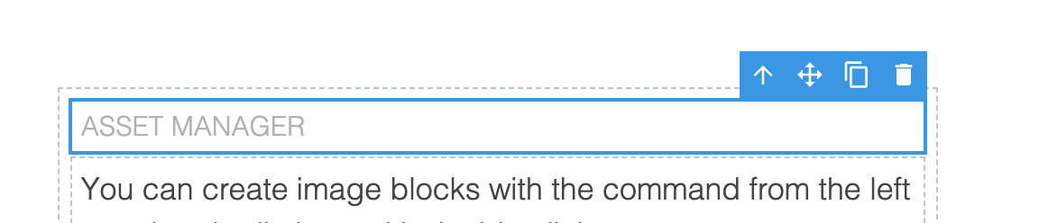
The select type is responsable for showing selected components and rendering the available toolbar items of the last selected component.
TIP
Get the toolbar items from the component.
const toolbarItems = editor.getSelected().toolbar;
# Resize type
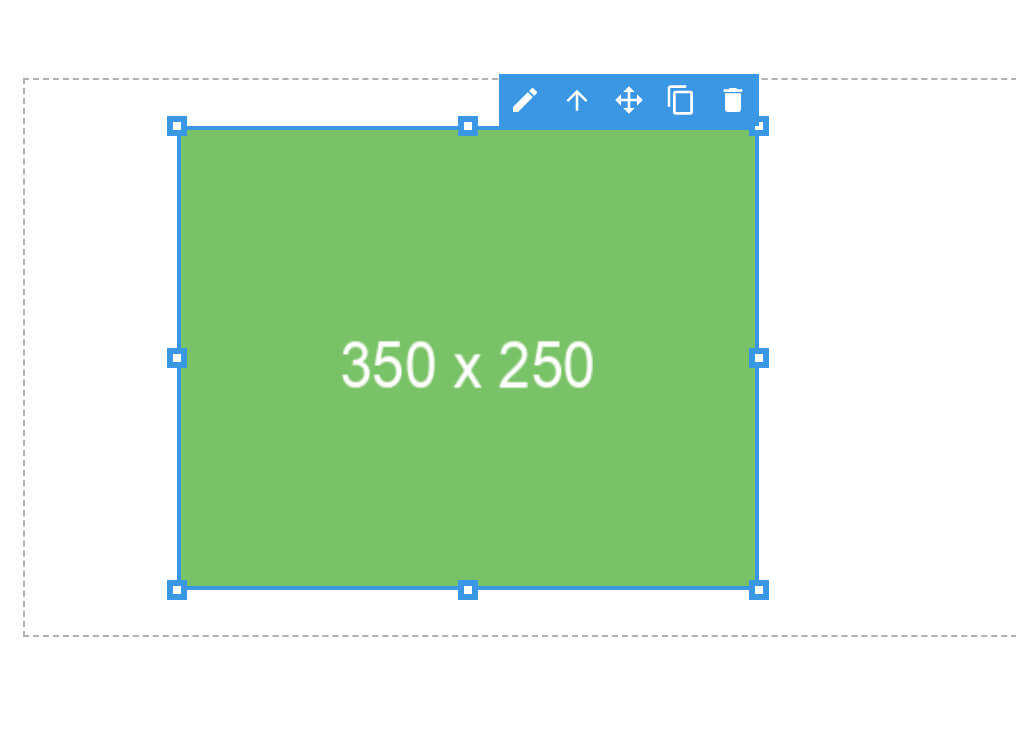
The resize type allows resizing of a component, based on the component's resizable options.
TIP
Get the component resizable options.
const resizable = editor.getSelected().resizable;
# Target type
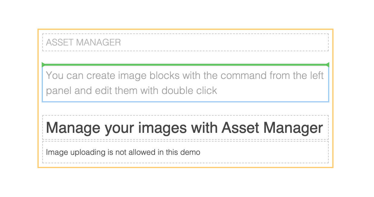
The target type is used to highlight the component, like during the drag & drop, to show where the component will be placed.
WARNING
The default green position indicator is not part of the spot but you can easily customize it via CSS.
.gjs-placeholder.horizontal {
  border-color: transparent red;
}
.gjs-placeholder.vertical {
  border-color: red transparent;
}
.gjs-placeholder-int {
  background-color: red;
}
# Hover type
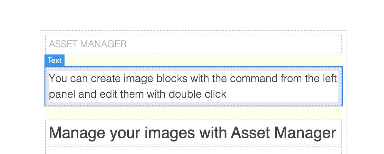
The hover is used to highlight the hovered component and show the component name.
TIP
Get the component name.
const name = editor.getSelected().getName();
# Spacing type
The spacing type is used to show component offsets like paddings and margins (visible on the hover type image above).
# Disable built-in types
You can disable the rendering of built-in canvas spots (some or all of them) during the editor initialization.
grapesjs.init({
  // ...
  canvas: {
    // Disable only the hover type spot
    customSpots: {
      hover: true,
    },
    // Disable all built-in spots
    customSpots: true,
  },
});
In the next section, we'll see how it's possible to reuse the built-in spots and create your own.
# Spots customization
In the example below we'll see how to reuse the built-in hover canvas spot to render our custom highlighting rectangle (we'll disable the rendering of the default one) and create a new one in order to render a button below the selected text components.
Worth noting a few important points:
- Our custom container has to be moved inside the GrapesJS spots container.
editor.onReady(() => {
  Canvas.getSpotsEl().appendChild(this.$el);
});
- We pass the
componentto our custom spot, in order to have the style coordinates properly updated when we scroll the page or update the component.
Canvas.addSpot({ type: customSpotType, component });
- The single spot is placed properly with
spot.getStyle()
<div ... class="spot" :style="spot.getStyle()">...</div>
- The spots container, by default, relies on
pointer-events: none, in order to prevent the spot from blocking the interaction with the components. This is why we have to re-enable the pointer event on the button in order to make it interactable.
.spot-text-btn {
  /*...*/
  pointer-events: auto;
}
# Events
For a complete list of available events, you can check it here.